Finished Book

After making improvements to the pages I finished my book and sent it off for print.

This slideshow requires JavaScript.

I am pleased with how the book turned out, the print is of a good quality and all the illustrations look how they are supposed to. I think the uncoated paper works really well with the bold, bright colours.

I think that the book communicates what it was intended to in a clear and simple way. I think that it is effective at showing people the other symptoms of dementia and that people with dementia are still themselves, they are not defined by their diagnosis. I think the bright colours and simplicity of the book make it appeal to children however I think it is a book that a parent would need to read with a child rather than a child read it alone. I think that the text communicates effectively and encourages people to empathise with those that have dementia, allowing them to understand how they can feel. I think that the illustrations along with the text allow the reader to get to know Enid, demonstrating that people with dementia are still people, they have thoughts and feelings and they have accomplished things. These are things that I feel are often forgotten when someone is diagnosed with dementia.

To improve my book I could add some more suggestions and tips on how to cope with some of the symptoms listed in the story. I think this would help people and give them some hope that dementia doesn’t have to be so negative. I could also explain how dementia causes some of these symptoms to help people better understand the disease and what is happening to their friend or relative. I think that this could be important information to include as this is something else that people don’t really know about dementia. I think I could also improve the book by including more about Enid, the main character. I think that by including more about Enid and her life it would help to really make the reader realise what people with dementia go through and how it makes them feel.

The book flows well and I think the composition is varied enough so that it doesn’t repeat itself. I found it quite difficult to illustrate the text at times as its a sensitive topic but the book also needed to be engaging. I think the use of the goblin really helped me to do this, if I had not used the metaphor at all I think the book wouldn’t appeal to children as much, but I also think that by including humour, through the goblin, it makes this serious book seem more approachable.

Reflection on the story

A reflection on the process of creating the story for my book and how it was informed.

To write the story I took my research into vascular dementia and applied it to my Grandmother’s experience of having the disease. I wanted to create a story that wasn’t too personal or based entirely on her story as I wanted it to apply to other people, those who also have friends and family who have been diagnosed with dementia. I wanted my story to be factual so that it could teach people about the other symptoms of dementia that people often don’t know about. I wanted my story to explain what happened to the fictional character when she had dementia but to also make it clear that everyone experiences dementia in different ways. As well as showing people what happens when someone has vascular dementia I also wanted to provide the readers with little tips that can help to deal with some of the symptoms. pink hair pageSome of these tips were taken out of my research, for example, on the page about sundowning the character says she enjoys playing games to distract her. This tip was taken off the Alzheimers Society’s website where they have plenty of ideas to help people who are living with dementia. Other tips were taken directly from my experiences with my Grandmother, for example its repeated on a few pages in the book that the character likes talking about things she used to enjoy or talking with her family about her memories, this is something my Grandmother likes doing. 

I also wanted the story to focus on the person which is why its written from the point of view of the character, Sylvia. I didn’t want the story to talk about her, like she wasn’t there as I thought this could dehumanise her and put too much of the focus on her as a dementia sufferer rather than a person who has dementia. I felt that it was important for the book to show that even though she has dementia she is still a person that has thoughts and feeling and that she is still herself, even if it doesn’t seem like that sometimes. One of the symptoms of dementia that affects my Grandmother the most is that she says things she doesn’t mean sometimes, these things can be quite hurtful and worrisome but the important thing is to remember that she doesn’t mean it, she’s not the one saying these things, its the dementia. sundowning4This is where the idea of the dementia goblin came from. I wanted to show that it is the dementia doing these things and not the person so I decided to use the goblin to personify dementia. I originally decided to use this metaphor on every page but it made my page layouts repetitive. I then decided that I wanted my work to focus more on the person rather than the dementia so the goblin was nearly removed from my work entirely. I ended up using the goblin on some pages as I thought the metaphor works really well when talking about some symptoms of the disease, such as sundowning where the goblin is the only character on the page. tea page
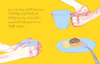
On other pages the goblin is less obvious, I think this works well as a gentle reminder that if someone has dementia it is always there even if it doesn’t seem like its affecting them. 

I think that my work has taken a complex subject and presented it in a way that is easily understandable and a way that encourages the reader to empathise with those who have dementia. I think that this book communicates information about vascular dementia in a way that people can easily understand and engage with and apply to their own situation. mobility page 2
It contrasts with the way that most information on vascular dementia is shown as I think it is a more sensitive and personal way to teach and inform people about such a complex, delicate subject. 

Dummy Book

A rough of a book about vascular dementia and how it affects people.

After creating a rough storyboard and some colour thumbnails I started making some roughs of the pages for my book. Most ideas are taken from the storyboards that I did. I used a ink dip pen with purple ink to sketch out what is on the page. I then used watercolour paints to add colour and texture. I then scanned them into the computer to create the book by adding coloured backgrounds and text. The font used is one that I created for another project but I thought it worked well with these pages.

This slideshow requires JavaScript.

The pages appear as double page spreads.

Open Brief – Final Outcome

The final outcome of the open brief project.

After making some designs for the final pages I made a dummy book. I then finished off the final pages. I used watercolours to paint the main features of the pages, I then digitally added the backgrounds. I created the font from my own handwriting, I think this works as it isn’t too messy but it looks more personal than a normal font.

The first page is made up of documents and letters that my Grandfather brought back with him from his time as a prisoner of war. I also included a photograph of him and another of him and some other soldiers.

I am fairly happy with how the pages turned out however there is still many changes that I would make to them. I think that I need to experiment more with how the text is placed on the images as it takes up quite a lot of space and detracts from the images a bit. I also need to improve the quality of some of the pages, I could do this by re-scanning some of the artwork ignorer to make it less blurry. I also need to improve the way that I cut out my images and apply them to flat colour backgrounds. One suggestion from my tutor was to use gouache, the same colour as the background, and apply it around the parts of the image that I wish to cut out, creating a smoother transition between the digital aspects and the watercolour parts. I will try this technique to improve my images. I also went to experiment more with the content of some of the pages, for example the third page, with the image of the boat sinking, I think that an image where the main character can clearly be seen climbing across a rope to the ship would be more effective and visually interesting. I would also like to include more textures from real items in the pages like the wooden box on the fifth page and the blindfold on the eleventh. I could paint on bits of the documents and letters and I have some Japanese fans that I could also incorporate.

I also made a cover for my book using images from the existing pages. book cover

Penguin Project – Research

Some research on eye catching book jackets that I have done for my latest project Penguin Book Project in which I have to create a book cover for the story Noughts and Crosses by Malorie Blackman.

Image result for penguin book covers
One Who Flew Over the Cuckoo’s Nest Illustrated by Ioana Negulescu 2012

I think that this image works well as a book cover as its quite striking and bold. I also like how the image relates to the story but it doesn’t give too much away. I like the use of colour, I think that they work well together to make the image lively but not too busy. I also like the different textures in the image, I think that the texture of the bark of the tree contrasts well with the texture on the pills.

To Kill A Mockingbird Illustrated by Madelyn Farley 2017

I think that this image works well as a book cover as it is very dynamic and striking. The contrast between the bright yellow background and black hand makes the book very eye-catching and intriguing. I also like the handwritten font, I think that it works really well with the image, I think that it allows the image to communicate in a more personal way.

BigSleep_CompetitionTemplate_COV.indd
The Big Sleep Illustrated by Hayley Warnham 2013


I think that this image works well as a cover as it is also quite dynamic. I also like the use of collage as I think that it contrasts nicely with the block colours behind it. I also like the use of negative space within the image. I think that the type font also works to well because of the sharp edges between the colours and the collage. I think that if a handwritten font was used it would just look messy and unprofessional in contrast to the other aspects of the image.

Grimms Fairy Tales Illustrated by Tim Parker 2012

I really like this book cover and I think that it really stands out as a design. I like all the different textures in the image, the wolf’s fur, the tree trunk spine and the red tongue. I also like the contrast between the blacks and greys with the red tongue and yellow eyes, it makes these features stand out in the image. I also think that the mixture of handwritten font and typed font works really well, I also like that some of the words are bigger than others to emphasise them.

Children’s Book Brief – Improved Final Pages

The further development of my final page spreads for the Children’s Book Brief

In order to improve my work I decided to develop my final pages further. I needed to neaten up the hand written text in order for my pages to look more professional. I did this by writing the text again using a thinner, sharper conte pencil.

I also re-did one of my pages entirely, I kept the same composition and idea for the page but I made the background lighter in order to bring the focus to the foreground of the image. I also changed the colour of the brother and the boar to more purple based browns so that they fit ore with the other colours used in the image. I also developed my technique further by using more of the conte pencil to highlight certain parts of the page other than just the characters. I think that this helped to pull the whole page together and it added a little bit more detail to the image.

Children’s Book Brief – Final Colour Pages

The development of my two final colour page spreads and the cover for my illustrated book based on the story The Singing Bone.

After I had finished my dummy book I started my finished, full colour page spreads. Part of the brief was to do 2 finished colour page spreads as well as the finished cover in colour. I started by choosing 2 pages that I thought would contrast with each other and that would look interesting in colour. I then used a number of materials to add colour including watercolour, gouache, acrylic paint and a conte pencil.

I then used photoshop and indesign to add text to the cover and to the pages. I also added page and bleed lines to the images. The text is hand written, I decided to do this as I felt it would fit with the simple, rustic theme more. This also allowed me to simply emphasise words which add to the drama of the story. I also made a change to one of the pages in photoshop, I decided to move the character up the page as he was too close to the edge, I think this has made him easier to see.

To improve these pages I would change some things. I need to re-doo the text to make it more even and regular as at the moment it looks too rough. I would also experiment more with line and develop the paint and charcoal/conte pencil technique. I would use different thicknesses of line in my images and use line for other parts of the pictures and not just the characters as i think this would help me to bring my composition together as a whole. I would also make the background lighter in the image with the boar in order to emphasise what is going on in the foreground.

Children’s Book Brief – Dummy Book

The mock book that I made containing pencil sketches based on the story The Singing Bone.

As part of the brief we had to produce a dummy book which included rough sketches for all of the pages of our book, the title page, the endpapers and the cover. I started by drawing out all my roughs first, I then stitched them together to keep them in place. I then made the endpapers and covers and attached them to the pages of the book. Most of the pages in my dummy book are the same as the rough sketches in my flat page plan. One of the things that I have changed is the position of the text on some of the pages so that I could fit it in without interfering with the images. I also changed the format of the text on the text only pages, they now have individual backgrounds to fit with each opposite page. Another change is that not all of the text pages feature the text in a white box, this feature only appears on some pages where the backgrounds are dark or the text overlaps different features of the background.

This slideshow requires JavaScript.

Children’s Book Brief – Colour Page Plan

A colour page plan for my illustrated book The Singing Bone based on The Grimm Brother’s story for the children’s book brief.

In order to demonstrate how my book would look in full colour I made a rougher, more vague version of my page plan. I used watercolours to roughly show what colours would be present on each page and where. I did this as it helps people to get a better feel for how the whole book would look, it also emphasises what is happening on each page and it helps the viewer to connect with the story more.

Children’s Book Brief – Book Layout

The page plan for my illustrated children’s book based on the story The Singing Bone by the Grimm Brothers. this is for the children’s book brief.

After deciding how the characters would look I moved on to the flat plan layout of my book. I started by deciding on the format of my book. i have chosen to make a square book as it will allow me to do double page landscapes and I think that a square book will be more appealing to children. The text that I will be using for my book is the original text from the Grimm Brothers that has been translated. Once I had decided on what version I was using I read through the text breaking it up into different pages. I then drew out my ideas for each page. I decided to vary the layout with some pages being double page spreads and some pages just being text and some just an image. I thought that this layout would make the book more visually interesting and it also allowed me to incorporate the whole text as the story is quite long.

IMAG0099IMAG0101
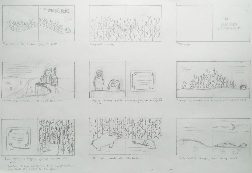
I was quite happy with how well the layout flowed so I will not be re-dooing this page plan but I will be doing a colour version of this to show how the book would look in colour as a whole as colour is quite important for a children’s book. I am not too happy with some of the pages but I would like to test them in colour first to see what they’d look like. I like the continuation of trees throughout my book, for example their inclusion on the endpapers, I think that it helps to bring the whole book together and that it also helps to make it flow visually. To improve it I think that the characters need to be brought to life more, on some of the pages in the book they look too wooden and not alive.